Where It Started:
Wax Wings is a consultancy business that helps people make critical decisions in game design. At its core, the interaction between game system and players is paramount to success. Wax Wings defines its work as prudent, ambitious, and influential.
Sidney Icarus of Decaying Orbit came to me wanting to create a logo that represented these ideas, and all that the company values. We wanted to ensure that these characteristics were expressed in the logo itself, as well as throughout the brand identity.
THE PROCESS
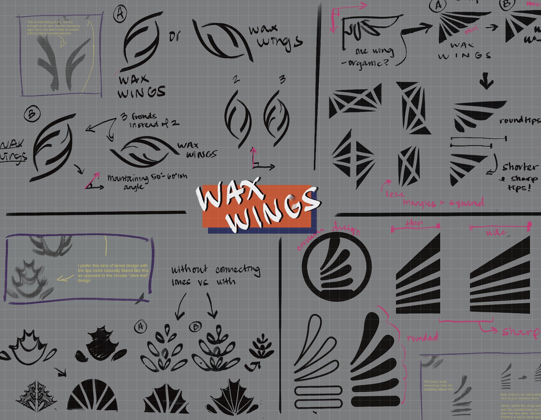
Began with a series of sketches based on the name. The top four were selected and cleaned up to define the shape. After deliberation, the first two options were chosen and made into vectors. These two were the strongest representation of both “wings” and abstract elegance.
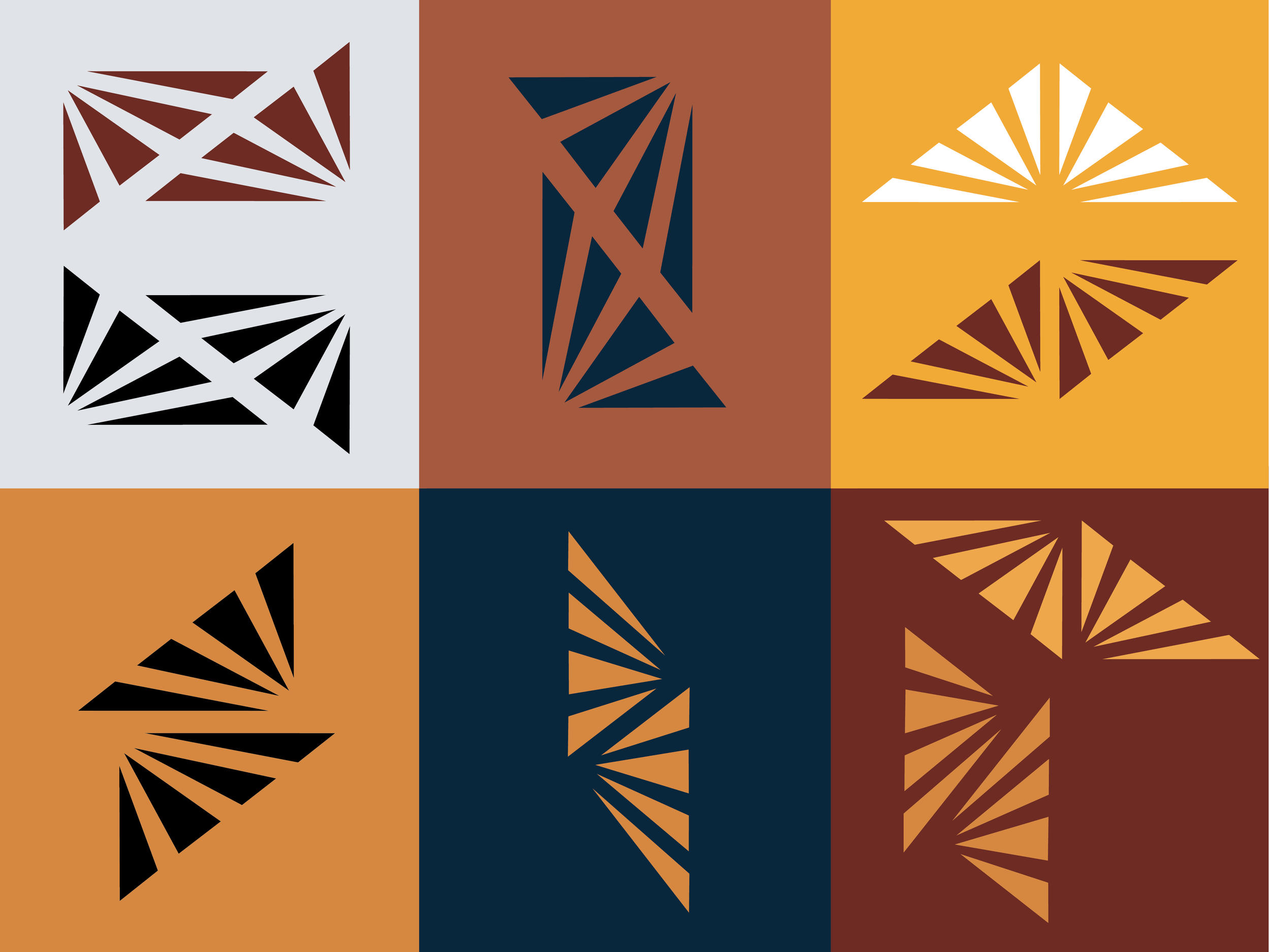
After the vectors were made, we played with different iterations between the position of the wings, as well as different orientations of the logo itself.
Applying color itself was what solidified the decision between the options. The colors derived from existing brand colors.


